Zigcast
Improving the user experience of an advertising mobile product
My role
User Research, Wireframing & Visual Design.
Team
Obinna Momah, Bernard Gabriel
Category
Media & Advertising, SAAS
Summary
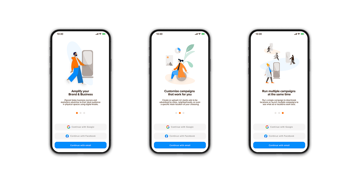
Zigcast, a digital signage startup, aimed to help small businesses effectively engage customers in physical spaces. However, small business owners often view advertising as an expense rather than a revenue-generating investment due to limited digital marketing knowledge and trust.
View Case Study